|
<< Click to Display Table of Contents >> Editing Skins |
  
|
|
<< Click to Display Table of Contents >> Editing Skins |
  
|
You arrive at the screens on this page if on the Managing Skins Screen you pressed the Manage Skins button, selected the Draft Skin Set, selected a Skin, then pressed the Edit button. With these screen you can set colors, button styles, and fonts to create your own custom skin.
The Managing Skins Screen
You are still on the Managing Skins Screen. What you see here is a screen for editing a skin created by the Add Skin button when the Draft Skin Set is selected. You can see how to do this here Managing .
The skin is all black and white except for the two red buttons.
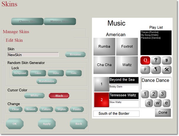
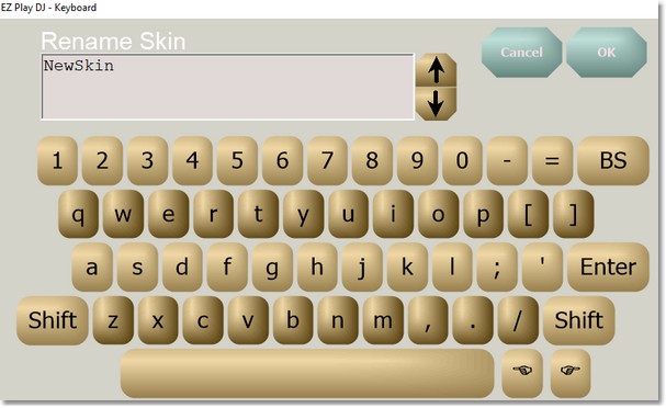
The Skin can be renamed. Press the Rename button and the Keyboard Screen, where you can enter a new name for the Skin.
Random Skin Generator
Below the Rename button is the Random Skin Generator section.
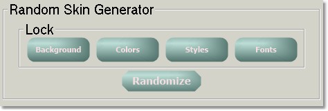
These buttons provide a quick and easy to experiment with skins. Press the Randomize button and random background color, other colors, button styles (shape, border, surface) and fonts are selected. Press it a few times. You might end up with something like this.
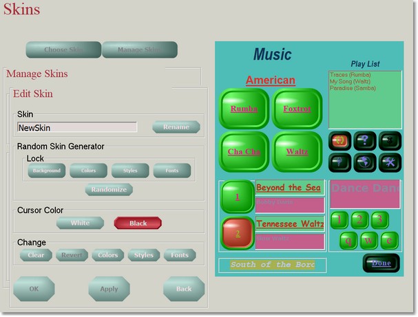
You like the background color and the button styles, but not the other colors or the fonts. You can continue with randomizong the other colors and fonts without changing the background color or button styles. Press the Background and Styles buttons in the Lock box.

Now press the Randomize button until you like what you see better.
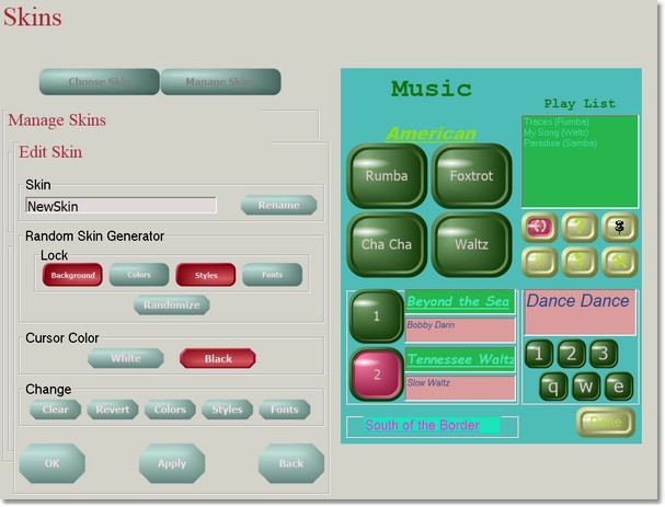
Now you like the button colors but not the text box colors, and the fonts need some work. You will have to edit the elements of the skin individually.
Cursor Color
Below the Random Skin Generator are the Cursor Color buttons.

These buttons are used to set the default cursor color for the Skin.
Change
Below the Cursor Color Buttons is a group of buttons labeled 'Change'.

Clear
The Clear button resets the Skin to the blank set, the same blank skin that is created when the Add button on the Managing Skins Screen.
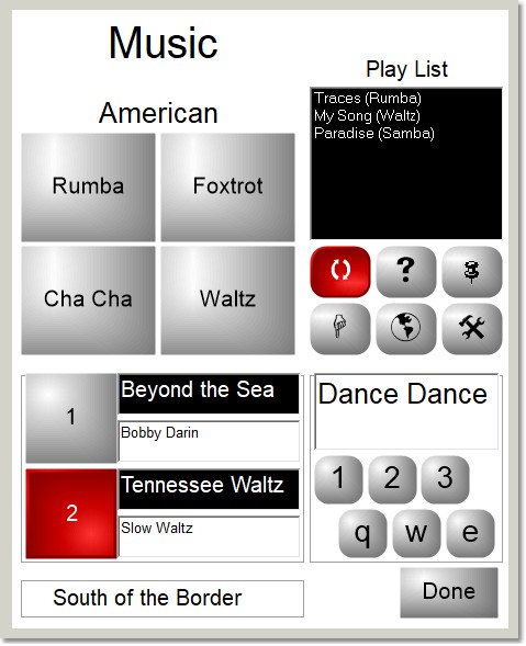
Revert
The Revert button sets the Skin to what it was the last time that you pressed the Apply or OK button.
Colors
The Colors button changes the left side of the screen to a color editor.
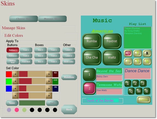
At the top of the color editor is a group of 14 buttons in a box labeled Apply To. They represent the elements of the Skin.
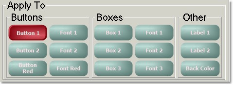
Three of the buttons represent button faces, three represent button caption fonts, three represent box background colors, three represent box caption fonts, two represent label caption fonts, and one represents the background color. Only one can be selected. The color editor edits the color of selected button, button font, box, box font, label font, or background.
Below the Apply To buttons is a group of controls that set the color of the selected Skin element. Four of them are sliders with left and right buttons.
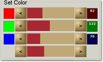
The top three sliders are used to adjust the component colors, red, green, and blue, of the Skin element. Press the left or right button to adjust the color. The value of a color can range from 0 to 255. The bottom slider moves all three of the component color sliders at once.
Below the four sliders is this.

This section allows you to save up to seven colors for reuse later. In this example there have been three colors stored in the past. The Save and Get buttons are not enabled because none of the seven color buttons is selected. Let's select the one in the middle.

Now we see that the middle color button is bigger, because it is selected. And the Save and Get buttons are now enabled. Let's press the Save button.

The color is saved.
On the right side of the Set Color section is this button.
Pressing it will generate a random color for the selected Skin element.
If the color for the selected Skin element is changed by the slider controls, the Get button for saved colors, or the Random button, another button appears. Let's retrieve one of the saved colors.
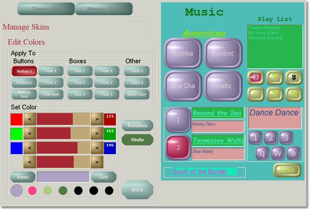
That looks terrible. Note that the new button is labeled Undo and has the previous color of the Skin element.
Press the Undo button.
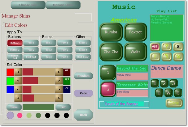
Now it looks better, back to the original color. Note that the buttons on the right side of the Set Color section now look like this.
This button will take you back to the color that the Undo button undid.
Press the Back button to return to Edit Skin.
Styles
The Styles button changes the left side of the screen to a button style editor.
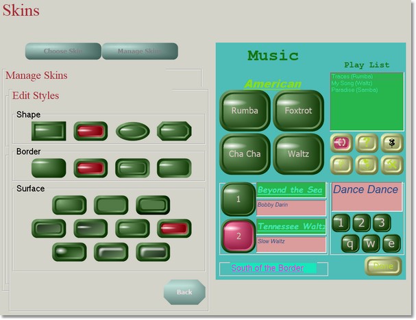
At the top of the style editor is a group of four buttons in a box labeled Shape. They represent the four possible shapes that a button can have. Press the button with the shape that you like to select it.
. 
Below the Shape buttons is a group of four buttons in a box labeled Border. They represent the four possible borders that a button can have. Press the button with the border that you like to select it.

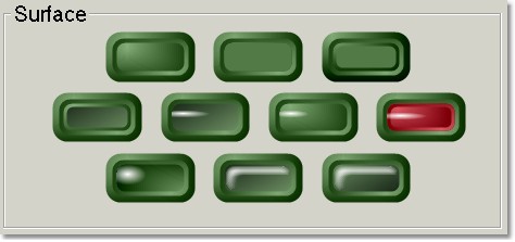
Below the Border buttons is a group of ten buttons in a box labeled Surface. They represent the ten possible surfaces that a button can have. Press the button with the surface that you like to select it.
Fonts
The Fonts button changes the left side of the screen to a font editor.
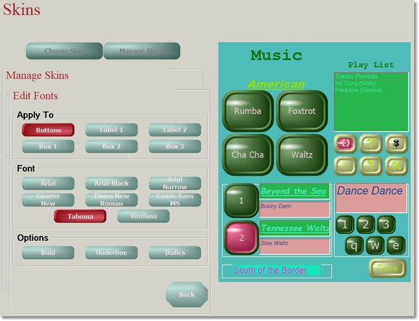
At the top of the style editor is a group of six buttons in a box labeled Apply To. They represent the six possible Skin elements that have a font. Press the button for the Skin element that will have its font modified..

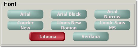
Below the Apply To buttons is a group of eight buttons in a box labeled Font. They represent the eight possible fonts that can be applied to a Skin element. Press the button with the font that you like to select it.
Below the Font buttons is a group of three buttons in a box labeled Options. They represent the three possible options that can be applied to a font,, Underline, and Italics. Select whichever ones you want to apply to the selected font.

.